Comics

Comic Books / Graphic Novels

Irredeemable vol. 1

Irredeemable volume 1Irredeemable is a graphic novel by Mark Waid and Peter Krause. The credits list colorist Andrew Dalhouse, letterer Ed Dukeshire, editor Matt Gagnon, and designer Paul Azaceta. It was originally published in thirty-seven single-issue “comics” from April 2009 to May 2012.  Volume 1 collects issues 1-4 and was released in October of 2009. Boom! Studios published the series.

“When the Plutonian, the world’s greatest hero, snaps and turns into the world’s greatest villain, only his former teammates have a chance at stopping his rampage.  But while on the run from the world’s most powerful and angry being, will these former teammates discover his secrets in time? How did he come to this? What became of the hope and promise once inside of him? What happens to the world when its savior betrays it? What makes a hero irredeemable?” — from the back cover

Lately, I have been carefully turning the blood-splattered and dark pages of a few graphic novel volumes that all explore some darker and badder themes. (i.e. Kill or be Killed, The Boys, etc.)  Irredeemable is, for me, the most gripping. I am engaged in the story and enjoy reading the volume. This is different than when I read The Boys or Kill or be Killed, because with those I feel I am turning a more critical, clinical, analytical eye on them. But they do not engage me; at most, I think I am repulsed or disgusted. I’m kind of splashing around in the murk currently. That being said, there is plenty of comparison between these three works in that they all delve into the worst of the worst.

Irredeemable has a storyline that has been toyed with here and there in many places in any number of comics. However, Waid really takes the idea to the extreme in this series. The Plutonian is designed as a blonde-haired white chap who wears a red and white or, later, red and black superhero outfit. (You know what I mean by “outfit.” The usual onesie!)

The series starts off with the Plutonian seemingly cruelly terrorizing a superhero/supervillain’s home. The first few pages deliver the feeling of frantic, desperate attempts to flee and the deadpan cruelty of a super-powered individual. I like that the series starts in media res without any heads up warning.  And these first few pages set the tone for the whole volume generally – a scrabbling, scrambling by everyone contrasted with the suddenness of the Plutonian.

Horribly shocking – emotionally, rather than just gore and splatter – in places. The abject helplessness of the citizens, the confusion and scattered attempts by the heroes, the suddenness and sourness of the Plutonian’s actions…all serve to make this work very gripping. The reader knows not much less than the participants of the story – why is this happening, what is going on? In chapter two, we are given a little more backstory – hints that a failed relationship with a female co-worker might be a catalyst for Plutonian’s rage. Secretly, though, I was (and am) hoping this is not the sole driving force in the story. It seems too pathetic for this level of character exploration. Even as chapter three begins, Waid complicates the former failed relationship even more – hinting at a situation involving Bette Noir (fellow hero teammate).

I like how Waid surprises the reader.  For example, the Singapore event is sudden and layered in surprising actions by the characters. Even when the reader knows how much of a bad dude the Plutonian is, still Waid is able to surprise the reader – that’s some mighty good writing in any genre.

I also am intrigued by the character Qubit. He is interesting and seems to be a good juxtaposition against the Plutonian’s over-powered skillset. Lastly, Waid keeps a key element to the storyline teased, but never presented – whomever Modeus is and whatever their relevance is, readers will have to keep reading to find out. Qubit really seems to be desperate for locating Modeus, so it must be vital.

Not for the sensitive or faint of heart. There are acts here that one would call “massive evil.”  The story is not one of happiness and even if good manages, somehow, to triumph like we all are comfortable with – too much destruction has occurred to call it a triumph.

3 stars

Kill Or Be Killed

Kill or Be Killed volume 1Kill Or Be Killed is a “graphic novel” series that began in August 2016 and ended in June 2018.  This work was originally published in twenty “comic issues” 40+ pages each. I read The tradeback version of volume 1 that was released in 2017. The series is a collaboration between creators Ed Brubaker and Sean Phillips.  Creator Elizabeth Breitweiser’s work was nominated for the industry’s Eisner Award for best coloring.  Volume one contains the first four issues of the series.
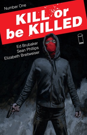
I have read and owned many comics and graphic novels – not as many as some folks, more than others. I have been a comics addict since I was in single digits; I began as a solid follower of the DC universe (specifically, Superboy and the Legion of Superhereos, of all things).  After years of DC-focus, I did also read the G.I. JOE series by Marvel, and eventually things like Ghost Rider etc. I still very much prefer superhero comics.

However, I will, on occasion, read something a little less fantastic; for example Jason Aaron’s Scalped series or Matt Kindt’s Dept. H. I usually do not go for the bloodiest, goriest, or most depraved stuff. However, I am currently working my way (carefully, with goggles and gloves on) through Garth Ennis & Darick Robertson’s The Boys as-well-as Mark Waid’s Irredeemable.  It takes me awhile to read things like this because I do not love being soaked in the murk and mire.  Anyway, Kill Or Be Killed runs right along with these other series. Lots of grit and gore and dark.

Brubaker wanted to take the state of the world to the extreme, allegedly. Still, in a book filled with less than saintly situations – this seems to be far from amoral. Indeed, the volume seems more like an exploration of the far ends of extreme morality. This amuses me a bit…. ethics as extreme sport.

The main character, Dylan, is an upper-twenties graduate student. This guy has so many issues and problems that it is quite absurd.  I am well aware that there are people in this world with tons of “issues.” I understand that many people are a mess.  Brubaker has to start off with a character stuff with problems and twists in order to make the result – the effects – even more disturbed and wild. I think that if he selected a completely legit generally put-together individual, it would not seem plausible. While Brubaker is taking this concept to the extreme, he still wants have it feel highly plausible.

The storyline has a thread that develops from Dylan’s father:  he committed suicide and had latent anger regarding how “….life screws over everybody somehow…”  So many characters with so many major issues. Is this realistic? Is this showing how troubles get passed onward or envelop people within various spheres of influence?  Or is it too much madness in one storyline? I reckon we will find out in future volumes.

This plausibility becomes sketchy with the introduction of the ultimatum that the main character is given.  A demon basically tells Dylan to “kill or be killed.”  Now, the introduction of this shadowy creature changes the story a bit. Adding a supernatural element to the story now makes it seem like Brubaker is cheating a bit. However, we can redeem Brubaker if need be, by making several arguments:  1. Dylan is a fellow with lots of issues – severe mental issues are present and may be expanded by any drug usage he may partake in; 2. If the demon is not a figment of Dylan’s mind nor a product of drug usage, it could still be metaphorical; 3. it could be illness-induced especially from lack of sleep or high fever.

Or it could be a demon, I guess. However, I dislike this last option for one reason. At one point the demon sort of “explains” why he is making this ultimatum and he says because Dylan survived a suicide attempt. Therefore, he has to “pay up” in a sense for having his own life saved. This feels….. too contrived for a real demon. Yeah, I know that sounds a bit ridiculous. My thought is that an entity that is making this sort of ultimatum is not one that I would easily believe resorts to tally-sheet style behaviors. It just does not seem nuanced enough. More believable is the idea that the surviving of the suicide attempt has induced a twisted reasoning process in an already disturbed mind – that also may have suffered untreated physical head trauma.

The best parts of the story, for me, are most of the explorations of morality “questions.” I am also interested in how this grad student becomes proficient at his new task. Right, wrong, or indifferent, I like how all of this is really a derivation of The Shadow. (I have an enduring interest in The Shadow.)  Indeed, I felt, as I read along, that I should eventually come upon some paraphrase of:  “Who knows what evil lurks in the hearts of men? The Shadow knows!”  

The worst parts of the story, for me, are any of the parts with Kira. I really dislike her. I understand that she is a key ingredient in Dylan’s mental soup, which brings about some of the tragedy. But I really cannot fathom anyone putting up with her shenanigans. I know Brubaker gives us a few glimpses into her past, which has its own set of depraved situations, as a sort of explanation for her current behaviors. I am not sold on this, though. The segments with Kira are tedious for me.

One thing that I would like to praise is how perfectly the artwork works with the storyline. The art is actually very good. Anyway, this is not a story for the faint. No children. No innocent hearts. No readers who dislike the abyss, noir, depravity, questionable morality, or demons. R-rated and slamming into a whole mess of those bad topics.

3 stars

Southern Bastards #1

Southern Bastards #1 - Image Comics; Aaron & Latour

Southern Bastards #1 – Image Comics; Aaron & Latour (2014)

I used to read comic books as a wee one. I had a bunch of 1970s issues that I read and then re-read until they burned into my skull. If I concentrate I can still picture the frames and stories in my mind. I feverishly collected G.I. Joe and Ghost Rider comics through the 80s and early 90s. I let comics fall out of my life for awhile for a variety of reasons. But in 2005 I picked up a copy of Ghost Rider. Thus started the avalanche… again.  Well, this is good and bad. And I like different comics for different reasons. Mostly, its pure entertainment and fun, which is good. But the best thing about picking up comics again is comic book creator Jason Aaron.

I think this guy has loads of talent and I have tried to buy the titles/volumes that he has been associated with. He’s become a lot more popular and recognized in the last few years and he is well-deserving of this. But even in his earlier works, he was a great creator. One of the reasons that I know Aaron is good at this stuff is that a number of his titles are in settings I actually dislike. He has characters that I hate. And he also has storylines that I would normally avoid. But time after time I am drawn to his stuff and I enjoy the heck out of it.

I have thoroughly enjoyed Aaron’s work:  Ghost Rider, Scalped, Wolverine, etc. All of these titles are infused with a deep Alabama understanding. Setting is a major component to what Aaron writes. And he consistently authentically portrays that “Southern” (for lack of a better word) culture, counter-culture, stereotype, and worldview. I’ve been meaning to read his newest title, Southern Bastards, for some time. Finally, I picked up a copy of issue #1. And it was entirely as expected:  settings and characters and storylines that I grimace and cringe at – meanwhile seeing the depth and awesomeness to the whole thing. And now I am craving issue #2.

This title has artwork by Jason Latour, who is also a born Southerner. I think the two creators work very well together – the art and the story are presented really well. Sometimes I feel there is a disconnect between writer and artist. Whenever that happens, I know because I find myself focusing solely on the art or the words. In this issue, I think the two parts are basically seamless.

This “sequentially-published graphic novel” is not for everyone. Definitely R-rated. Definitely not for the squeamish or for the superhero fan. Like many of Aaron’s stories, this title seems to pierce the heart of a deeply-southern small town. This isn’t pseud-refined antebellum English colonial stuff. This is backwoods, BBQ-loving, isolated country. The kind of place that has more churches than commercial businesses and focuses on high school football. The opening page artwork has a dog relieving itself on the outskirts of town.

But if you can get past the gritty and grisly stuff, the story seems very realistic.  And there is a depth and substance to the story beyond the frames of violence. Aaron always produces stories about people who are conflicted, stubborn, and while sometimes simple, are never simpletons. After you read the first issue you do not know where Aaron will go with the story, but you suspect it will involve baseball bats, pick-up trucks, town corruption, and characters taking a good hard look at their inner man.

Earl Tubb (Image Comics)

Earl Tubb (Image Comics)

We meet Earl Tubb in the cab of a U-Haul style truck as he drives into what seems to be his hometown – where he grew up. Immediately, we are given to understand he has not been there in a long, long time. Earl has conflicts right after eating his BBQ lunch. He runs into an old “acquaintance” who recognizes him. He stops that scraggly character from being beaten to death. Throughout, we are shown that Earl has issues with his deceased father, who’s grave he visits.  Earl has a USMC tattoo and he is a big, towering sort of chap. After finishing this issue, yeah, I want to know more about Earl – Aaron has made me care about Earl. Even if I hate his putrid little southern town…

4 stars

Solar: Man of the Atom #1

Solar: Man of the Atom #1, Dynamite Comics; 2014

Doctor Solar has a new series.  Dynamite Comics just released the first issue in a series.  Here is a character that has had a long history – but without much fame and glory.  I believe he was created by Paul S. Newman and Matt Murphy in the 1960s for a comic series with the publisher Gold Key Comics.  I have no idea how I know of this pulp/vintage character.  It is a case of one of those things that I know without knowing exactly how I know.

I know that in 2010 Dark Horse Comics released a small series entitled Doctor Solar.  I think they only made it 8 issues – through design or low sales, I do not know why it ended.  This is not as bad as it seems – Solar’s original run with Gold Key Comics in the 1960s only ran about 30 issues.  But here we are in 2014 and now it seems the property has gone to Dynamite Comics (founded 2005).  If you glance at Dynamite’s title list, you will notice that the majority are franchises from TV or film. Or even books.  Nevertheless, I read nothing of the Dark Horse comics series – so when I saw Solar #1 sitting on a shelf at my local comic book store I grabbed it.

I read it first – out of the large stack of comics that came home with me.

This issue displays the efforts of writer Frank H. Barbiere, artist Joe Bennett, colorist Lauren Affe, with cover artist Juan Doe (probably an alias, but why would you not take credit for this cover?).  I am a terrible sucker for (well, obviously, comic books) (1.) science fiction-esque covers/comics; (2.) vintage/pulp.  I really liked the cover Doe gave us for this issue and seeing Doctor Solar in his own title again definitely was the root cause of my spending $3.99.  Cover art does matter – it is not just something to glance at and cruise on past.

Solar #1, first page; Dynamite Comics

The first page is a keeper, as well, if you are science fiction addict. How can you see the cover, and then the first page, and then not be hooked?  One of the things that I like, generally, about this whole issue is the artwork and coloring.  It is really eye-catching and pleasing.  It works very well with the story.

Now, since I hardly recall any origin story for Doctor Solar, I cannot speak on this issue’s heritage or loyalty to the character.  I can say that the storyline here is worth reading, even if it does not seem incredibly unique.  I mean, a story in which there are estranged family members, ambitious, genius scientists, and rather dull bank robbers does not rank very highly in the annals of originality.  Nevertheless, I do not always need a first issue to be original – I do need it to have elements which will draw me back for issue #2.  That is definitely to be found here.  And so, I think the money was well spent.  It is rather difficult to say much else regarding the storyline – but if the art keeps up and the story progresses, I can see this being a safe monthly purchase.

4 stars

Superman Unchained #1

Superman Unchained #1 – J. Lee, S. Snyder; DC Comics; 2013

Because we are nearing the end of the year and I have not done a comic book review in awhile, I figured it was time. Not to mention the INSANE backlog of comics stacked around the premises.  I would show you pictures, but I think it would terrify.  Anyway, I happily dove into the first issue of DC’s Superman Unchained title.  This issue starts a new series and was highly anticipated by readers.  Anything involving Superman generally makes news, however the excitement over this title comes from the creator team of Scott Snyder and Jim Lee.  I think DC jumped onto these facts and slapped a $4.99 on the cover just to see if they could do it – i.e. how much value does Snyder/Lee have in terms of buyers?

The cover is nice.  You can tell immediately that it is Jim Lee’s work.  It features the New 52-style Superman (younger and updated costume) ripping through some sort of technological debris. Superman has a gritty look as opposed to the happy, accomplished look he tends to wear.  I really wonder, though, what DC was thinking with the “Unchained” part.  Is this some cool, youthful lingo?  You know, the dialect in which we would say “this is off the chain” or “no limits.”  But the thing is, the whole concept of Superman is that he is never chained.  He’s unchained, y’all…………

frame, Superman Unchained #1, J. Lee, S. Snyder, DC Comics; 2013

I really like the artwork in this issue.  It has frames from all points-of-view and angles.  I like the coloring – very colorful and sharply defined.  I always think of Jim Lee’s work as being high-definition and highly-sharpened.  Included in this issue (and perhaps to soften the price point) is a tagged-in four-fold “poster” that actually is part of the issue.  This fold-out section is part of the storyline – just the art needed an embiggened format to be shown.  Now, did it? Sure, I guess, maybe.  I am not real fond of gimmicks like this.  I found it a bit cumbersome to unseal, unfold, read, and then re-fold.  Overall, the Superman here is drawn with shadows, while frowning in concentration, with youth and almost a slightly dark feel.

The storyline is okay.  I think that Snyder has proven himself a very capable and interesting writer with his laudable work on the Batman title.  In this issue, there are included several pages of “interview” material with Snyder and Lee and he makes some comments regarding the differences and similarities between the characters Batman and Superman.  I do think Snyder will be writing us a Supes who is a bit heavier and grittier than those 1980s Superman characterizations. Anyway, the storyline is kind of vague.  Satellites are falling to Earth – Superman is reacting to this. Clark Kent and Superman (or do we speak of them as the same?) are “investigating” the situation.  A supposed-terrorist/crime group called Ascension is hinted at – the whole time all the characters tell us “it cannot be Ascension who did this.”  Of course, Superman’s go-to is Lex Luthor (who has a few frames which perfectly depict his arrogance.  There are some threads with Lois’ father and historical events (WWII).  Overall, Snyder is setting up a big storyline for us, so it’s too early to decipher much other than there are a few interesting elements here.

I am going to give this 4 out of 5 stars – for the art, for the seemingly bold direction Snyder is driving toward, and because this feels stronger than the Action Comics and Superman titles’ starts with the New 52.  I own issues #2 – 4, so I will have to see where this goes.  Still, at $4.99 I am not entirely sure all readers will feel they got their value.

4 stars

Blue Beetle #1 (1986)

Blue Beetle #1 (1986) – DC Comics;

Blue Beetle is a character that has hung around comics history for a long time.  He has an early history in the late 1930s and 1940s with Fox Comics and Charlton Comics.  In 1983, along with most of Charlton Comics properties, the character rights were sold to DC Comics.  The character has had a pretty interesting history that practically parallels the history of American comics. But this is not a history blog. I finally got my hands on a nice copy of DC Comics’ 1986 #1 issue of Blue Beetle.  I got it for .50¢ and am totally thrilled with the purchase.

This iteration of Blue Beetle is the scientist Ted Kord.  In this issue, we are introduced to the character as he leaves retirement to once again enter public service.  Fires are being set in buildings all over downtown Chicago – and the Blue Beetle appears to deal with this problem. The writer for this issue is Len Wein; Paris Cullins and Bruce D. Patterson are the artists.

I love the way this issue begins.  In fact, lately, I have been loving all pre-1990s comics.  They have this depth in the writing that I feel is a little missing in current-day comics. I am not talking about the level of writing, really. I feel like these older (vintage?) comics have this wordsmithing knack to them.  Sometimes it seems a little hokey, but sometimes, it’s almost poetic.  That’s one of the main things that is really drawing my interest into these pre-1990s issues again and again.

Blue Beetle #1 (1986) – frame one, page one; DC Comics

Last night, as the household was lulling into sleep, I carefully pulled the issue from its plastic sleeve.  I opened to the first page and fell in love with the first frame.  How about that?  I harp on the importance of the first issue, first book, etc. of all the things I read.  Because I am a big believer of the first impression concept with these things.  Authors/artists have to hook the reader.  They have to make the reader care, be engaged, and show us competence.  Lots of work for first issues.  So look at the copy in the first frame – its poetic, I tell you.

Okay, maybe not great poetry, but nowadays the copy would read:  “Lots of big fires are burning in Chicago.”  I particularly like the “fugitive sparks” part. Awesome. Thank you, Len Wein.

The story is actually really good.  Kord is a scientist entrepreneur who moonlights as Blue Beetle.  He discovers that the arsonist isn’t just a criminal with a dim view of city planning, but an armored villain named Firefist. (Okay, maybe not the least goofy of names…)  Anyway, in their first fight, Firefist gets away, but Blue Beetle makes plans to take Firefist on.

We get a little history of the previous Blue Beetle series, which is good. We meet a villain that seems really intense.  We learn about Ted Kord’s double-life.  And the banter between characters is witty and cute.  Finally, you have to read the next issue – you want to and need to. This is an excellent comic. It really makes me love the character a lot.  If you really want to dig into comics beyond the usual adoration for Batman and Superman, I think Blue Beetle might be for you.

5 stars

The Flash Vol. 1: Move Forward

The Flash vol. 1: Move Forward – DC Comics; Francis Manapul & Brian Buccellato

I have been working my way through a number of the first volumes of DC’s New 52 comics series – the ones that I do not have on my pull list.  So far, I read Animal Man, which I thought was a bust, and Demon Knights, which was really good, but as of issue 23 or 24, it’s been canceled.   The next volume I read through was The Flash.  This volume is really good and I do wish I had gotten on board and put it on my pull list with issue #1.   The first volume, entitled Move Forward, collects the first 8 issues of the series.  This is a neat thing because frequently these hardback/tradeback volumes only collect five or six issues.

This series, so far, has had creators Francis Manapul and Brian Buccellato and I think they have done a fantastic job.  Everything works well in these first eight issues.  The DC New 52 was supposed to be able to introduce and draw in new readership who have not been involved in comics or who are unfamiliar with DC’s universe.  Not all of the New 52 series have accomplished this goal with a seamless and non-confusing presentation.  The Flash, however, definitely succeeds – and probably the best of all that I have read.  Excellent work on that point.  Secondly, I love all of the art.  I love the covers – and the variant covers.  I love the interior art.  I also am really impressed by each individual issue’s splash page – the title pages are actually “artistic.”  Go figure! Real design in a comic book!

The Flash #3 variant cover – Jim Lee; DC Comics

The storyline is decent.  The first five issues (in terms of the story) were not absolutely awesome and amazing (or whatever words are used today to describe really cool things), but the story was solid and readable.  Not every story is a rock ’em shock ’em big deal and a huge universe-spanning event.  The storylines here are good and solid and accessible – so precisely what one should demand from a comic series. Therefore, I have no complaints.

The characterizations are also good.  It struck me while reading through this volume that of all the superheroes that DC has, I think working on The Flash has to be the most fun.  I cannot imagine the creators not having fun with this.  He’s fun to draw, fun to write.  And I think that fun shows through in this volume.  It is not goofy or silly (sometimes Spider-man is intolerably goofy), but Flash is fun.  And if comics do not, at the end of the day, contain any fun – what’s the whole point?  The supporting characters are also developed nicely; Patty Spivot and Iris West are interesting and do not seem to be there just as filler characters.  In this series, Barry Allen has a lot of good qualities and can definitely sustain a long-term ongoing comic.  And that, too, is precisely what readers should be looking for.

I think this title got over-looked and treated poorly by readers who got all caught up in Scott Snyder’s Batman title and with the Grant Morrison working on Action Comics thing.  However, while Batman has been excellent, the Action Comics title has suffered a lot.  Meanwhile, The Flash has been solid – at least through the first eight issues – and I think readers ought to give it a chance – or even a second chance, if that is the case.  I really enjoyed the art and design and the character is fun and good.  This is a five-star volume.

5 stars

Demon Knights Vol. 1

Demon Knights, Vol. 1 – DC Comics

After returning N. Gaiman’s The Sandman Vol. 1 to the library, I picked up Demon Knights Vol. 1.   Demon Knights is a title DC introduced as part of their New 52 reorganization/reboot in 2011.   I confess that I was not/am not fully versed in DC’s magic realm. I know of The Phantom Stranger and I know of The Spectre, but that’s about it.  The demon Etrigan and his connection to Merlin and Vandal Savage has a vague and fuzzy image in my brain.   However, I saw this tradeback sitting on the shelf and could not resist.

This volume collects issues #1-7 of the title.  I had no idea what to expect and after reading it, I am a happy reader. The title has survived the various “waves” of roster moves that DC made since the New 52, which is good.  (Some titles, like Blue Beetle, didn’t last.)  Overall, the story is interesting and the art is suitable.  It’s not perfect, the flaws are there, but I think as a whole this title adds a diversification to the DC lineup that allows readers to read something different than a Bat-title (how many are there? 6? 8?)

So, when I say that I had no idea what to expect, I mean it. I just enjoyed the cover for a few minutes and then started turning pages.  The story starts off at the fall of Camelot.  Arthur is dead and three women are in a boat taking his body to Avalon.  Excalibur is tossed into the waters – but Xanadu, one of the women in the boat, dives after the sword.  We are then taken to the castle wherein we are given something of a point of departure for the demon Etrigan.  Merlin has summoned and captured the demon.  Jason of Norwich, a young boy, enters to tell Merlin the castle has fallen and they must flee. Merlin then “fixes” the demon to Jason.  Moving forward in time, we meet Mordru and the Questing Queen.  They are marching their horde army through the land to Alba Sarum.

That’s basically the first issue.  And while it is a bit in media res, the careful reader can follow the storyline well enough.  Part of the impetus of the New 52 was to re-introduce readers to the DC universe – without the readership having to be familiar with the entirety of DC’s history.  I think this is done in this issue/volume, but it does take some patience.  In some places in this volume, it seems like a simple battle book.  I think that the “demon knights” are made distinct enough by the writer (Paul Cornell), but I also think that the storyline moved really fast.  We are given some background story on some characters, perhaps enough to keep readers curious, but maybe not enough to keep us invested in the scenarios.

I like Conan and Kull and so this title works for me.  I like the dark ages feel to it, with the debates of battle-strategy, magical elements, and questions of personal honor and destiny.  The pacing was a bit too quick for me and the Questing Queen seems too distant/unknown to me.  Also, I’m kind of guessing at how the magic powering works… people seem to “power down” and “power up,” but I am not entirely sure how that works exactly. Madame Xanadu is definitely a good character and has a lot of fun frames by the artist.  Also, the covers done by Michael Choi are really pretty.

I definitely want to read the next volume – and I hope DC keeps this title running.  Overall, I’m going to give this volume 4 stars.

4 stars

The Sandman vol 1: Preludes & Nocturnes

The Sandman Vol 1 – N. Gaiman; Vertigo

I finished reading Neil Gaiman’s massively-famous The Sandman: Vol 1, Preludes & Nocturnes.  I had found the second volume very cheap at a library book sale. I have been putting off reading this series for a very long time, so when I got volume two practically free, I decided I would bite the bullet and read.  The Sandman is a series that began in 1989 and continued through 75 issue until 1996.  It has won acclaim in both the comics-community and in the general media (e.g. New York Times and Entertainment Weekly).

I have never been interested in this series because, after some review of the matter, I think that I am not on the same wavelength as Gaiman.  That’s a fair way of putting it.   I find Gaiman a bit creepy.  Not that I have ever met him, mind you.  There are female friends in my world who use the word “skeevy.”  No one has ever defined that word for me and I am hardly an expert in its usage.  However, if I had to associate it – yeah, it’s gonna be with Gaiman.  When I was dragging my feet about reading this series, I looked Gaiman up on Wikipedia. I even read an article about his wife.  Yeah, neither one is going to get invited over to a tea party at my house.  Again, nothing against them – we just come from widely divergent universes. Also, “gothic” is usually just creepy.

I actually attempted to read a couple of Gaiman’s novels.  I think I got at least 25 pages in Neverwhere.  And I did watch the DVD of Coraline.  But that’s as far as I was able to get.  Something about his writing or his ideas doesn’t mesh with me.  That is okay. I would rather be honest about it than lie and pretend to be a fanboy over this.

First impressions:  (1.)  the main character, Morpheus, looks like Gaiman.  And it’s not a look I like.  Arrogant of the author?; (2.)  man, I hope this isn’t just a revenge tale; (3.) The art is gritty. Dunno if I like the layouts.

After reading volume one, I can say that some of the contents are very dark and disturbed (depraved?).  But these elements are luckily buried in a story that is tolerable, not great.  The question is:  is the story there to provide a context for the darkness or do the disturbing parts just fill-out an otherwise credible storyline?  Immediately, I think most fans would say the latter.  I am not so sure.  There are some good ideas, don’t get me wrong.  For example, the interactions and juxtapositions in “Imperfect Hosts” is quite original and creative and I can get behind some of this inventiveness.   The same goes for “A Hope in Hell.”  Both of these issues demonstrate the best that is offered in this volume.  Creative and interesting.  But throughout the rest is a very dark and dim view of humanity.

I was never really able to sympathize or enjoy the Morpheus character.  Particularly, with his moping around and stereotypical portrait.  Pale, hairy, moping Gothic creature. And the thing is, while we are led to believe that this character has insight and is cunning, generally, I found him boring and lucky.  I am not familiar with Jack Kirby’s Sandman character, but I cannot say that Gaiman’s characterization is a winner for me.

So here is the thing. . . not all authors have universal audiences.  Many authors are able to reach most audiences.  Some strive to increase their audience.  Some authors have a select, carefully segmented audience and seek only to reach that number.  I suspect a lot of readers really dig Gaiman’s work and he does have a widespread audience.  For better or worse, though, I am not in that number.  I can recognize the quality parts in this volume, but hands-down I am completely more entertained and interested in Locke & Key and Scalped.   I do intend to read volume two of The Sandman, but we will see if I ever get father than that.  I am going to give the first volume three stars – because I do think it is deserving of precisely three.

3 stars

Locke & Key – Welcome to Lovecraft

Locke & Key 1; IDW

Locke & Key Volume 1 – J. Hill, G. Rodriguez; IDW, 2008

I finished reading the first collected volume of graphic novel Locke & Key by writer Joe Hill and artist Gabriel Rodriguez.  The hardback edition I read is entitled Welcome to Lovecraft and was released in 2008. It collects the first six issues of the comic by the same name published by IDW comic publishers.  One of the decisions that I made going into 2013 was to read more graphic novels and from different publishers than I usually do.  Locke & Key has continued for several volumes and has gotten a lot of praise.  So I figured that I would try it out and see how it goes.  Also, because the author names the location for the story “Lovecraft,” I admit I was intrigued.  If an author invokes that name in his writing, one almost expects creepy, weird, scary stuff – so I was all set to read something well-done.

The story, generally, is about the Locke family and the family’s ancestral home, Keyhouse, a Massachusetts mansion with a fantastic collection of magical keys and doors.  And this story is not for kids.  Some bad language, some gore, some horror, etc.  I do not think it is a foul book (I wouldn’t read that…) but it does have a smattering of bad. After all, this is technically in the “horror” genre.  Anyway, Keyhouse.   This is the main focal point of the story.  This is interesting because usually authors use a character as a focal point and not a setting.  The first issue in the volume starts in media res and fills in some backstory via flashback, however, even at the end of the issue – the reader will have a number of questions about the whole thing.  And this is okay because by the end of the volume many of these are fleshed-out and resolved. Of course, new questions are then presented!

The father, Rendell Locke is murdered by a high schooler named Sam Lesser.  And though it seems a random murder by a particularly deranged teenager, the connection is Keyhouse.  We are told in flashback that if anything is to happen to Rendell, the family is to go live at Keyhouse with Rendell’s brother, Duncan.  Why? In a cryptic statement Rendell tells his wife that “the house chose Duncan.”  Clearly, Rendell is not oblivious to the mysteries of Keyhouse.  After the murder, the family (mom, older brother, middle sister, young brother) travel from California to MA to live at Keyhouse and everyone is dealing with the loss of Rendell and the change in their lives.

My biggest problem with the artwork is that Duncan and the mother, Nina, look the same age as the kids in the novel.  Assuming the oldest kid, Tyler, is 17 – the mother and the uncle still only look 25 at most.  This kind of didn’t work for me – not that I expected them to be old and haggard or something.  The best part of the artwork is how much the artist seems to mesh with the story and draw scenes which amplify and parallel the writing.  Sometimes a writer’s good idea might fall a bit flat without a diligent, capable artist. No fear of that here.

At the start I was a little confused. Back-and-forth in time was disconcerting – what happened when and where? But I got it all sorted out and reading got a lot better.  Joe Hill did an excellent job developing each character, especially the kids.  Tyler is a compelling character and is written and drawn really well.  Bode is a lot of readers’ favorite character because he’s a curious, intelligent kid who loves his family.  He’s a cute kid.  Kinsey, the girl, is also a strong personality and independent.  Hill’s characterizations are so good that one really is “pulling for” this family.  It is really important to have likeable characters that a reader can sympathize with and follow along with interest.  Without this – this storyline would not be worth reading.   The villain in this volume (Sam Lesser) is exceedingly hateable.  He’s repulsive and deranged and I dislike him a lot. This is also “good” because who wants a villain that is not really a villain?

There are some really cool plot twists – the frame where Bode sends two items down the well is awesome, how Lesser escapes from prison is sharp, and the interconnectivity of characters in Lovecraft adds to the suspense.  In other words, I liked the unfolding of the story and its pacing. After finishing the volume I want to get the next. I have these questions:  what happens next (re: Zack)?  How will the connection Duncan to the house and everything else develop?  How will Tyler and Bode’s relationship change after the events of issue six?

I recommend this book to those who enjoy suspense/horror, good character development, and who are over 18.

4 stars